
As the Dow breaks through the 18,000 level and the U.S. Dollar Index surges through 90, below are two incredibly fascinating 45-year charts of the silver market as we come to the end of 2014. This is the type of thing that the big banks follow closely, as well as big money and savvy professionals. David P. out of Europe sent us the two key charts of silver.
he first chart is a long-term (monthly) look at the price of silver going all the way back to 1968 (click on the chart to enlarge):
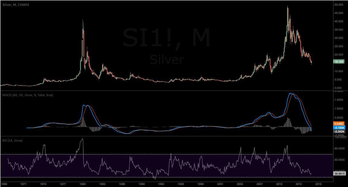
You can see the initial surge in the early 1970s on the left hand side of the chart. You can also see the massive surge in 1980 (center left side of the chart) where the price of silver hit an all-time record. On the right hand side of the chart above you can see the current secular bull market in silver, including the cyclical bear phase.
The second chart below is a long-term (weekly) look at the price of silver going all the way back to 1968 (click on the chart to enlarge):
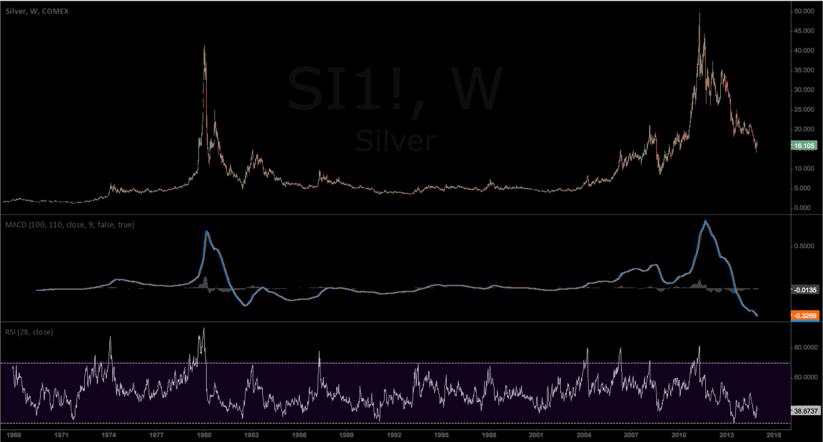
As you can see, the MACD indicator is buried at the lowest level in the past 50 years. When the silver market finally turns, it will be in for a remarkable rally to the upside. 2015 is most likely the year we see that historic rally.
No comments:
Post a Comment