
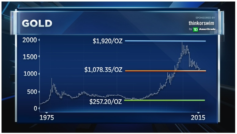
Looking at a very long-term chart of gold, Worth pointed out that the precious metal has hit a critical technical level. “If you were to draw a line along the peaks at or near the highs since 2011, we’ve flirted with this downtrend line three or four different times,” he added. “Any type of [continued] strength will do one thing: it will start to move us above this downtrend line that’s been in effect for three years (see chart below).”
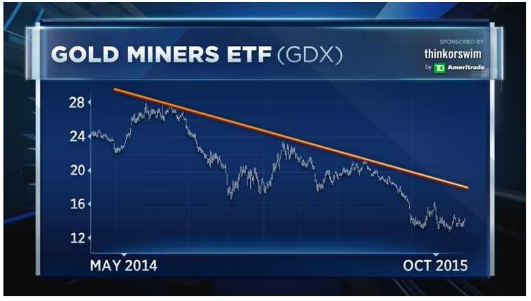
For Worth, rather than pile into the commodity itself, investors could stand to profit more from gold-related stocks, specifically the gold miners. “Gold is halfway back from its low but if you look at gold miners [they] are at the all-time lows,” he said. The gold miners ETF, the GDX, is down more than 18 percent in 2015. “We’re going to play this off this all-time low and make a bet,” he added. By Worth’s work, the GDX should begin to catch up to gold (see chart below).
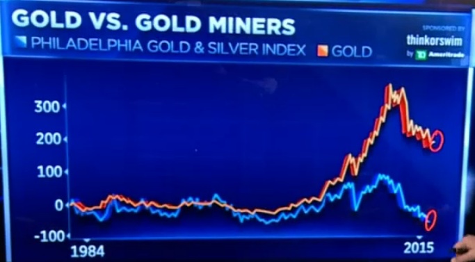
Is This The Most Shocking Chart In The History Of The Gold Market?
King World News note: If you look at the chart below, it shows the shocking disparity in history between the mining shares and the price of gold. Mining shares are at an all-time low vs the price of gold. This disparity cannot last and the turn in favor of the mining shares will be quite spectacular. In the fullness of time this will surely be seen as one of the greatest opportunities in the history of the gold market (see chart below).
No comments:
Post a Comment